- Published on
Analysis of data on House Sales in King County, USA
- Authors

- Name
- Antonio Lorenzo
- @ToniLorenzo28
Title: Analysis of data on House Sales in King County, USA
Author: Antonio Lorenzo
Subject: Data Analysis
Language: English
In this small project we will test the power of data analysis in the real estate sector, analyzing information on the sales prices of various homes in King County, USA.
Import dependencies
import pandas as pd
import DSTOOLS as ds
import matplotlib.pyplot as plt
import numpy as np
Explore the data
Get the data
path = r'your path'
data = pd.read_csv(path)
Columns definition
"""
id - Unique ID for each home sold
date - Date of the home sale
price - Price of each home sold
bedrooms - Number of bedrooms
bathrooms - Number of bathrooms, where .5 accounts for a room with a toilet but no shower
sqft_living - Square footage of the apartments interior living space
sqft_lot - Square footage of the land space
floors - Number of floors
waterfront - A dummy variable for whether the apartment was overlooking the waterfront or not
view - An index from 0 to 4 of how good the view of the property was
condition - An index from 1 to 5 on the condition of the apartment,
grade - An index from 1 to 13, where 1-3 falls short of building construction and design, 7 has an average level of construction and design, and 11-13 have a high quality level of construction and design.
sqft_above - The square footage of the interior housing space that is above ground level
sqft_basement - The square footage of the interior housing space that is below ground level
yr_built - The year the house was initially built
yr_renovated - The year of the house’s last renovation
zipcode - What zipcode area the house is in
lat - Lattitude
long - Longitude
sqft_living15 - The square footage of interior housing living space for the nearest 15 neighbors
sqft_lot15 - The square footage of the land lots of the nearest 15 neighbors"""
Take a quick look at the data structure
#Function to modify the number of rows and columns allowed to be displayed on the screen, by default there is no limit.
def display_options(max_columns = None, max_rows = None):
    pd.options.display.max_columns = max_columns
    pd.options.display.max_rows = max_rows
    return print('Changes applied')

#Set display options to None in max_columns and max_rows
display_options()
#Take a quick look at the data structure
#data.head() #This output has been omitted to shorten the document.
#Use custom tool to see data structure (shape, null values)
#ds.data_estructure(data) #This output has been omitted to shorten the document.
#Use tool to see data types
#ds.categ_data(data) #This output has been omitted to shorten the document.
#Summary of each numerical attribute
#data.describe() #This output has been omitted to shorten the document.
Discover and Visualize the Data to Gain Insights
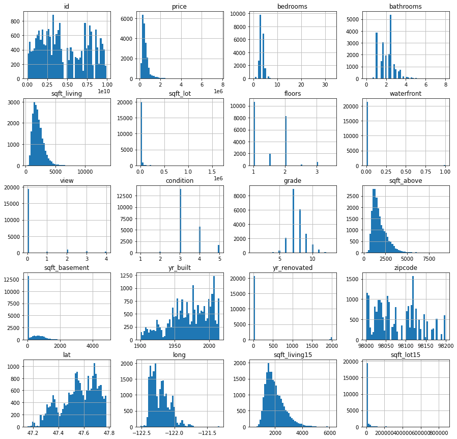
#Visualize data distribution
data.hist(bins=50, figsize=(15,15))
For a little more context, here is an image of King County in the USA
#Load a real image to compare with data
from IPython.display import Image
img_path = r'C:\Users\anton\Documents\Datasets\KC_HOUSES\kc_map.png'
Image(img_path)

Now we visualize according to the latitude and longitude of the data, where the sold houses are located.
#Graphic to visuzalice density area of houses
fig ,ax = plt.subplots(figsize=(15,10))
plt.scatter(data['long'],data['lat'],alpha=0.2)
plt.title('Geographical data')
plt.xlabel('Longitude')
plt.ylabel('Latitude')

#Heat map to show the price level of different households
data.plot(kind="scatter", x="long", y="lat", alpha=0.3,label="houses prices",
          figsize=(10,7),c="price", cmap=plt.get_cmap("jet"), colorbar=True )
plt.title('Price of the houses')
plt.xlabel('Longitude')
plt.ylabel('Latitude')
plt.legend()
Let's visualize the price of houses in each area using a heat map.

Now, it would be interesting to know the average price per district, as well as how the various variables influence the price. To do this, we are going to perform a series of transformations on the data to be able to visualize them correctly
Transformations into the dataset
#We look up how many different zip code values there are
valores = data['zipcode'].value_counts()

#We observe them
#valores
#We assign only one zip code of each type
zips = valores.index
#We searched the internet to find the location by zip code.
locations = ['Seattle','Maple Valley','Seattle','Redmond','Seattle','Kent','Kirkland','Seattle','Federal way','Bellevue','Seattle','Renton','Renton',
                     'Seattle','Sammamish', 'Kirkland','Issaquah','Seattle','Renton','Redmond','Auburn','Sammamish','Seattle','Auburn','Seattle','Seattle',
                     'Seattle','Issaquah','Bellevue', 'Seattle','Snoqualmie','Seattle','Seattle','Bellevue','Kenmore','Mercer Island','Seattle','Federal way',
                    'Kent', 'Woodinville','Seattle','Seattle','Renton','Seattle','Seattle','Seattle','Kent','Seattle','Seattle','Enumclaw','Seattle','North Bend',
                    'Auburn','Woodinville','Bothell','Duvall','Seattle','Seattle','Bellevue','Bellevue','Seattle','Kent','Carnation','Vashon','Seattle','Seattle',
                    'Black Diamond','Fall City','Seattle','Medina']
#We create a dictionary to assign the district to each ZIP code.
zip_locations = {}
for x in range(len(zips)):
    zip_locations[zips[x]] = locations[x]
#We look at the dictionary
#zip_locations This output has been omitted to shorten the document.
#We create a list with each district assigned to the zip code where it belongs from the length of the data.
def_locations = []
for x in range(len(data)):
    def_locations.append(zip_locations[data['zipcode'][x]])
#We assign a new column with the locations
data = data.assign(Locations = def_locations)
#Observamos como se ven los datos ahora con la nueva columna
#data.head() #This output has been omitted to shorten the document.
We are now ready to start visualizing the data with the information obtained.
Let's see how many houses there are per district
#We group the data according to district
Localizations = data['Locations'].value_counts()
#We plot the number of houses per district
fig ,ax = plt.subplots(figsize=(15,10))
plt.barh(Localizations.index, width=Localizations)

Now let's see the number of houses per district distributed on a map.
# Plot showing the number of houses per district
fig, ax = plt.subplots(figsize=(15,10))
plt.scatter(data['long'], data['lat'], alpha=0.7)
plt.title('Number of houses per district')
plt.xlabel('Longitude')
plt.ylabel('Latitude')


# Latitude coordinates
y = [47.67304300,47.51227600,47.61998500,47.68130900,47.67510800,47.30850100,47.36878300,47.62362300,47.30934700,
        47.49025500,47.40497400,47.76095200,47.56488900,47.75441400,47.56601100,47.17335000,47.45136500,47.75724700,
        47.73832800,47.66043000,47.41229600,47.31855000,47.62878100,47.62762400]

# Longitude coordinates
x = [-122.34276600,-122.18853600,-122.20697900,-122.12078000,-122.19386300,-122.21567100,-122.19665000,-122.04220000,
        -122.36310500,-121.97503800,-122.00456500,-122.13075800,-121.77285200,-122.24676700,-122.23207500,-121.64145000,
        -121.60338700,-122.19814100,-121.79412900,-121.89709700,-122.47238700,-121.99561700,-121.77954500,-122.24233400]

# District names with the number of houses per district
annotations = ['Seattle = 8977', 'Renton = 1597', 'Bellevue = 1407', 'Redmond = 979', 'Kirkland = 977', 'Auburn = 912', 'Kent = 1203',
               'Sammamish = 800', 'Federal Way = 779', 'Issaquah = 733', 'Maple Valley = 590', 'Woodinville = 471', 'Snoqualmie = 310',
               'Kenmore = 283', 'Mercer Island = 282', 'Enumclaw = 234', 'North Bend = 221', 'Bothell', 'Duvall = 195', 'Carnation = 190',
               'Vashon = 124', 'Black Diamond = 100', 'Fall City = 81', 'Medina = 50']

# Plot red points for districts
plt.scatter(x, y, color='red')

# Assign annotations to the corresponding points
for i, label in enumerate(annotations):
    plt.annotate(annotations[i], (x[i], y[i]))

We now seek to know the average price per district
#We calculate the average price per location
med_price = data.groupby(['Locations']).mean()
#We plot the average price by location
fig ,ax = plt.subplots(figsize=(15,10))
plt.barh(med_price.index,med_price['price'])
plt.title('Mean price per district',fontsize=20)
plt.xlabel('Mean price')
plt.ylabel('Location')

#Creamos una nueva columna asignandole a cada distrito el precio medio de los hogares correspondiente
mean_d = {}
for x in range(len(med_price)):
    mean_d[med_price.index[x]] = med_price['price'][x]

mean_prices = []
for x in range(len(data)):
    mean_prices.append(mean_d[data['Locations'][x]])
#Añadimos la nueva columna a los datos
data = data.assign(mean_price_of_district = mean_prices)
# Heatmap to show the average price level per district
data.plot(kind="scatter", x="long", y="lat", alpha=0.5,label="houses",
          figsize=(15,10),c="mean_price_of_district", cmap=plt.get_cmap("gist_rainbow"), colorbar=True )

# District names
anotations = ['Seattle','Renton','Bellevue','Redmond', 'Kirkland','Auburn', 'Kent','Sammamish',
                        'Federal Way','Issaquah','Maple Valley','Woodinville','Snoqualmie','Kenmore',
                        'Mercer Island','Enumclaw','North Bend','Bothell','Duvall','Carnation','Vashon',
                        'Black Diamond','Fall City','Medina']

# Latitude coordinates
y = [47.67304300,47.51227600,47.61998500,47.68130900,47.67510800,47.30850100,47.36878300,47.62362300,47.30934700,
        47.49025500,47.40497400,47.76095200,47.56488900,47.75441400,47.56601100,47.17335000,47.45136500,47.75724700,
        47.73832800,47.66043000,47.41229600,47.31855000,47.62878100,47.62762400]

# Longitude coordinates
x = [-122.34276600,-122.18853600,-122.20697900,-122.12078000,-122.19386300,-122.21567100,-122.19665000,-122.04220000,
        -122.36310500,-121.97503800,-122.00456500,-122.13075800,-121.77285200,-122.24676700,-122.23207500,-121.64145000,
        -121.60338700,-122.19814100,-121.79412900,-121.89709700,-122.47238700,-121.99561700,-121.77954500,-122.24233400]

plt.title('Median house price per district')
plt.xlabel('Longitude')
plt.ylabel('Latitude')

# Add annotations to corresponding points
for i, label in enumerate(anotations):
    plt.annotate(anotations[i], (x[i], y[i]))

plt.legend()

Looking for correlations in the data related to the price
# We calculate the correlation matrix to see how variables are related
corr_matrix = data.corr()

# We check which variables have the highest correlation with the house price
corr_matrix['price'].sort_values(ascending=False)
price 1.000000 sqft_living 0.702035 grade 0.667434 sqft_above 0.605567 sqft_living15 0.585379 bathrooms 0.525138 mean_price_of_district 0.503354 view 0.397293 sqft_basement 0.323816 bedrooms 0.308350 lat 0.307003 waterfront 0.266369 floors 0.256794 yr_renovated 0.126434 sqft_lot 0.089661 sqft_lot15 0.082447 yr_built 0.054012 condition 0.036362 long 0.021626 id -0.016762 zipcode -0.053203 Name: price, dtype: float64
As we can see, the variables that are most related to the price are sqft_living and grade, let's visualize how the price is visually related to each one:
# We plot the relationship between square footage and price
data.plot(kind="scatter", x='sqft_living', y='price', alpha=0.3)

#We plot the relationship between grade and price
data.plot(kind="scatter",x='grade',y='price',alpha=0.4)

In this small project, we were able to perform transformations on data from homes sold in King County, USA to obtain key information on the variables that affect price as well as how these variables relate to territory being different in each district of King County.